We all know that Lightroom is a powerful tool for organizing and editing your photos. However, at some point in the learning process, many photographers will begin to wonder, “but, do my photos actually look good? Am I even doing it right?”
This article is for every photographer who ever felt like they’re just randomly playing with the adjustment sliders in Lightroom, and wondering if there should be a method to the madness. (Hint: there is!)

Of course, there is no single “right way” to edit your photos in Lightroom. There are many techniques, and everything is open to interpretation; after all, this is art!
However, Adobe is still trying to help make your life easier- they organized the Develop Module sliders this way on purpose! This is, approximately, the order in which you should make your adjustments. So, if all you’ve been doing so far is going top-down, then you’re off to a good start.
In this article, we’re going to specifically dive into the very first few sliders of the Develop Module, known as the Basic Panel, and talk about WHEN, WHY, and HOW you should adjust each one.
Lightroom Develop Module – Basic Panel Overview

If you haven’t already, to bring up the Lightroom Develop module just hit the hotkey “D”, and make sure the right-hand panel is open. (The hotkey to open/close both side panels is the “Tab” key.)
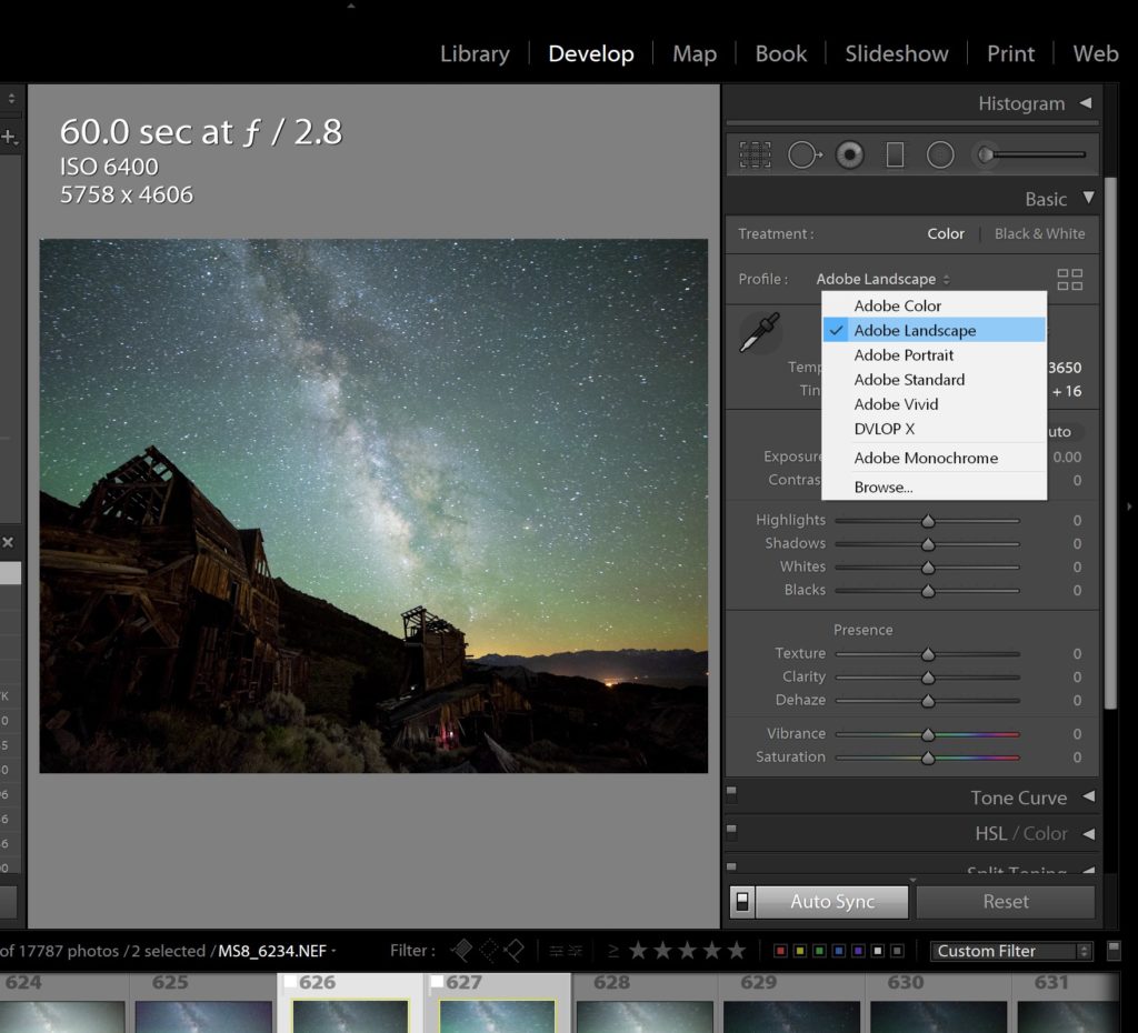
At the very top of the right-hand panel, you’ll see your histogram, some exposure info, a tool panel, and then the “Basic” panel. This Basic panel is where all of your photo editing should begin.
The first option is rather self-explanatory: For “Treatment:”, you’ll choose either Color or Black & White…

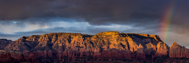
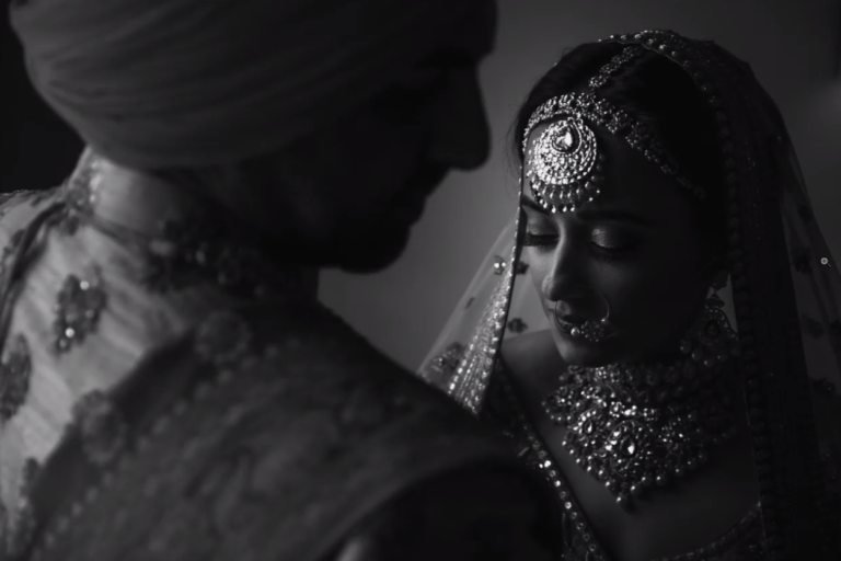
…Then, for the “Profile,” you can select the foundation of processing, so to speak. You could leave it alone, on “Adobe Color”, however, the options for “Adobe Landscape” or “Adobe Portrait” are particularly useful for images of those respective subjects. So, do give them a try and see if you like them. You can also dig deeper and choose even more profiles, including ones that attempt to match the colors you saw on the back of the camera, although they’re not always accurate.
Then, we finally come to actual sliders. First are the two White Balance sliders, beneath the main WB preset options… “Temp” and “Tint” will be how you control an image’s overall warmth (or coolness) as well as any other overall shifts:

Indeed, like we said earlier, there’s a reason your “Temp” slider is the very first slider in the entire Develop Module! You should almost always dial your color temperature first, before making any other adjustments. It doesn’t have to be perfect at first, in fact you’ll almost always come back to it once you’re done with the rest of your “tonal management”. However, it’s important to at least get your Temp, and then your Tint, to a good starting place before moving on to the rest of the sliders for “Tone”…
Lightroom Basic Panel Sliders – Tone
The “Tone” section of the Basic Panel comes next, with Exposure and Contrast, and then Highlights, Shadows, Whites, and Blacks. The goal of these sliders is to perform the biggest adjustments first, (that is, start at the top) …and then work your way down.

In other words, how can you dial your Highlights, Shadows, or Whites/Blacks perfectly, if your Exposure is way off? Therefore, dial your Exposure to a good starting point, and then consider the other five sliders.
You don’t necessarily need to adjust your Contrast immediately, though. Oftentimes, your Highlights or Shadows sliders will need some initial work, before you can see all the tones in your image well enough to accurately adjust the Contrast slider.
Lightroom Sliders – Highlights & Shadows, Whites & Blacks

So, just work your way down. The “heavy lifting” of highlight and shadow recovery is usually best done with the Highlights and Shadows sliders, and then the fine-tuning of preserving any remaining clipped highlights or truly dark shadows can be done with Whites and Blacks. Or, instead, if your image’s histogram is starting to look “flat” already, you might use the Whites slider to brighten them, and/or use the Blacks slider to actually darken those darkest shadows.

Once you think you’ve gotten everything in these sections to a good overall balance, work your way back up. Do you need to add any overall Contrast? Do you need to fine-tune your Temp or Tint? Now is the time to do so.
Lightroom Basic Panel Sliders -Presence

Once you’ve got your overall colors and tones dialed in, next you can very carefully play with the “Presence” section of the Basic Panel. Use these sliders sparingly though, because at this point it can be very easy to over-process your image and make it appear grunge-y and unnatural.
Lightroom Texture Slider

Texture affects the finest, smallest details in your image. It’s almost like sharpening, but on a slightly larger scale that you can just barely see without zooming in to 100%. (Although, setting Texture while zoomed in is recommended.)
For portrait images and other subjects that you might want to soften, feel free to dial Texture in the negative direction, to maybe -10 or -15 usually. Or, for images where you’d really like to see crisp, “crunchy” details, dialing Texture up to +10 or +20 will have a visible effect.
Lightroom Clarity Slider

Clarity is a lot like Texture, but on a slightly larger scale. Clarity is sometimes called “Micro-Contrast”, meaning it increases or decreases contrast on a smaller, more “local” scale than the main Contrast slider does. Again, use it sparingly, whether in the negative direction to soften tones of portraits etc, or to enhance the contrast of a dramatic B&W landscape image… Don’t forget to double-check it by zooming in to 100%, too.
Lightroom Dehaze Slider

Last but not least, Dehaze is the most powerful (and dangerous!) of the Presence sliders. Dehaze is meant to clean up images that actually have really strong haze in them, such as a foggy, flat scene, or a smoggy, smokey, or sunlit flare scene.
In these conditions, Dehaze can work like magic to clear up the tones of an image, although eventually it can make images look like a badly done HDR. Usually for the moderately hazy images, +20 or +30 is all you’ll ever need, and for extremely hazy images, +50-75 might even be required, though dialing in some negative Clarity and/or Texture to compensate may be necessary.
Dehaze can also be used on ordinary images, too, in fact it almost acts like that “magic” slider in Instagram’s image editing tool; it seems to add a little bit of literally every other slider, and it almost always looks good. However, be careful, especially if your image already has good contrast! Stick to no more than +10 or +20 in most cases.

NOTE: Texture, Clarity, and Dehaze are all algorithmic adjustments, meaning they affect each image differently, based on the actual tones and colors of that image. In other words, dialing +20 Dehaze on two different images could have a two very different effects!
Lightroom Vibrance & Saturation

The “Vibrance” and “Saturation” sliders are also very powerful, and at first glance they almost seem to have the exact same effect. However, once again, take Adobe’s suggestion: Try the Vibrance slider first, because it affects colors in a more realistic, gentle way- whereas the Saturation slider just adds saturation to every single color equally throughout the entire image, the Vibrance slider tends to only enhance colors that are already there, and ignore the colors that are more subtle.
HOWEVER, you know what? Honestly, if you dialed in all of your other sliders perfectly, from Exposure & Contrast to Dehaze, …then you might not need very much Vibrance, or any Saturation, at all!
Artistic License – Rules Are Meant To Be Broken!

Of course, we can’t conclude this tutorial without mentioning something that every artist (and Captain Barbossa) should always remember: these are more of what you’d call guidelines, than actual “rules”.

In other words, your creative style may lead you to process your images very differently! Some artistic styles may involve more vibrant, over-the-top looking imagery, while other styles may involve more muted, subtle looking imagery.
Of course, we do still stand by our actual order of operations: Whether you love to “go wild”, or “keep it simple”, you’ll probably want to adjust your slides in the order we described above.
The “Go Too Far, Then Come Back” Lightroom Editing Tip
Anyways, what style should you pursue? Experiment! Try things out, and see what you like or don’t like. Don’t be afraid to crank the sliders all the way to their maximums.
In fact, that’s one of the best tricks I’ve found to help me decide exactly what I like, and what my own personal style is- discovering what I DON’T like, defining what is “too much”, and then dialing the sliders back from that point. If you use this final guideline in your overall process, then the entire rest of the Lightroom Develop Module will start to become very easy to manage, too!
Get More In-Depth With Your Lightroom Editing & Workflow

For even more in-depth tutorials about Lightroom and the rest of the Develop Module, be sure to check out these full-length video workshops.


