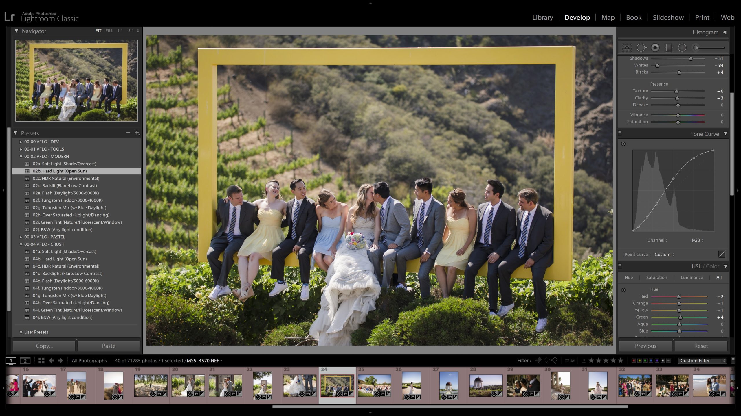
When you’re editing your photos it’s easy enough to understand things like brightness and contrast, but have you mastered tone curves yet? The Lightroom Tone Curve adjustments in the Develop Module are some of the most powerful, versatile tools available, however, there is a slight learning curve to master first.
In this article, we’ll explain exactly what a tone curve is, how to interpret/read it, and how to manipulate it to get exactly what you want from your images.
The Lightroom Tone Curve | What Does It All Mean?
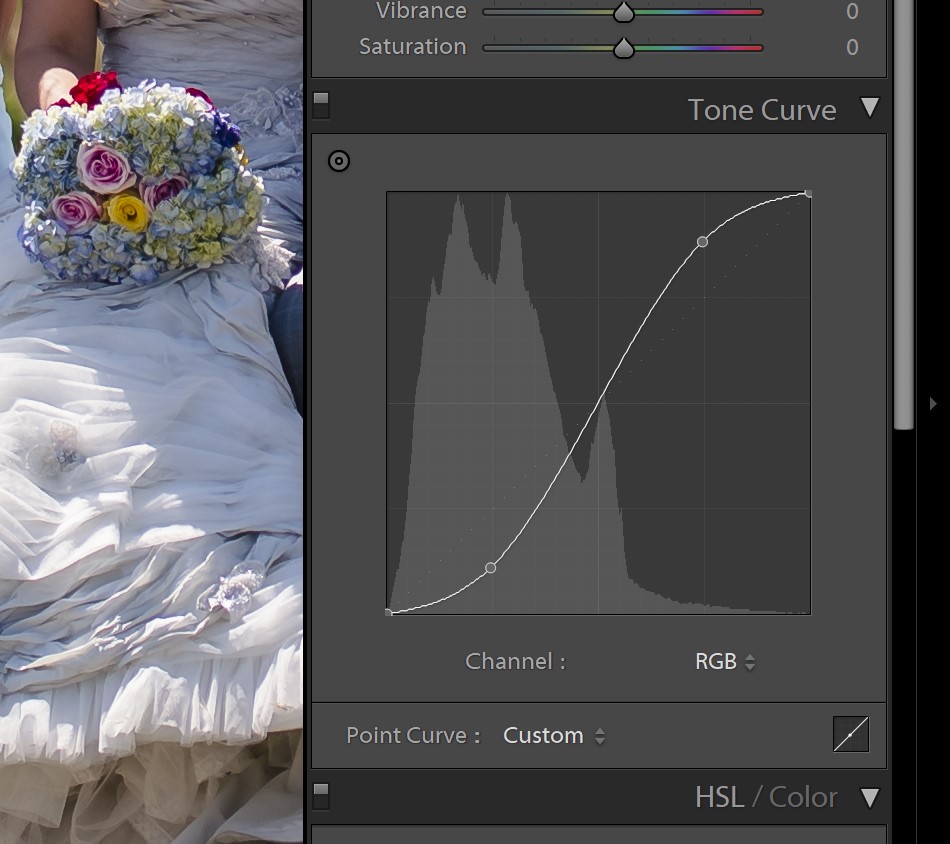
The tone curve is a visual way of adjusting the lightness of tones (and colors) in your image. Actually, it matches up with your image’s histogram! If you’ve already learned to read a histogram, then understanding a tone curve in Lightroom will be easy.
Basically, think of a tone curve as a graph that charts the tones of an image in terms of input and output. Every part of your image starts off at its current tone, from black to white, and this is the X-axis of the tone curve along the bottom edge of the graph. Then, the Y-axis represents the edited tone, also from black to white, going upward from the bottom edge.
So, if black was 0% and white was 100%, (0,0) would be pure black, and (100,100) would be pure white.
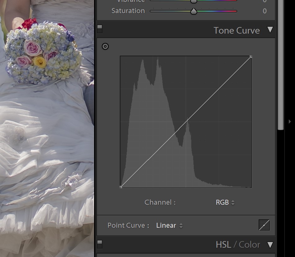
A completely un-edited image would show a tone curve without any curves at all, in fact, it would be a simple graph with a straight line going from black to white.
To actually put a tone curve to use, you need to create points along that straight line and move them away from their default. Usually, this means you are creating a point somewhere on the curve and dragging it upward to lighten, or downward to darken, that tone. You’ll also lighten or darken the nearby tones, of course, because the tone curve doesn’t usually make hard-angle turns, the line remains gradual and curving.
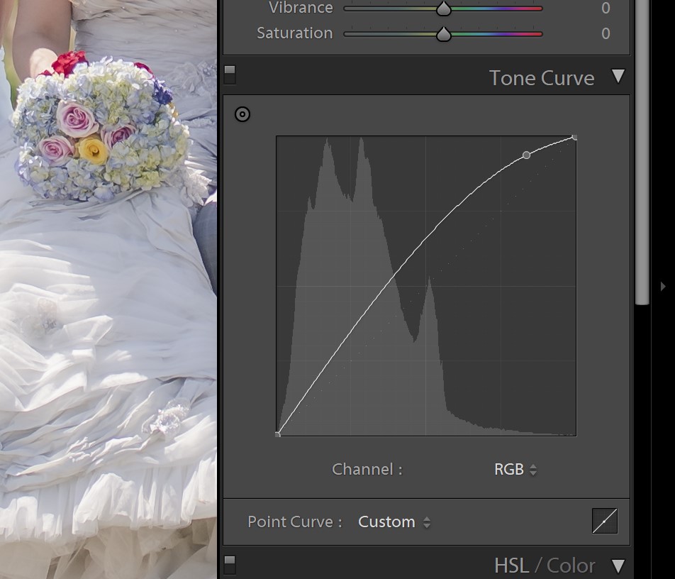
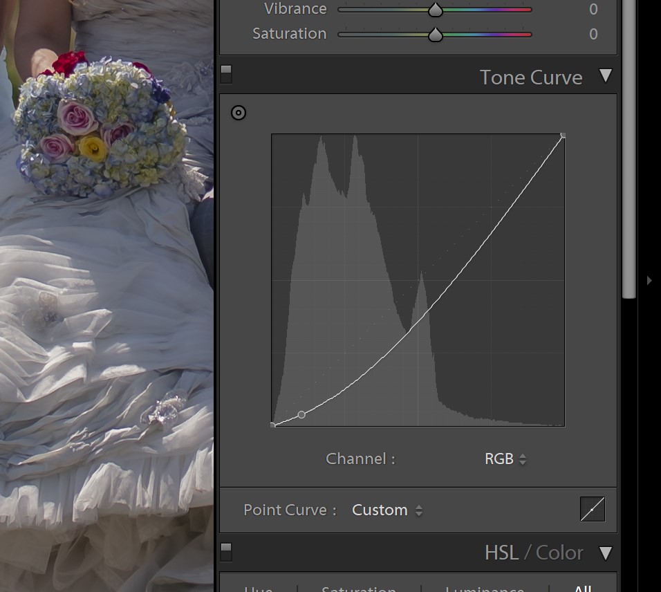
You can create as many points along the curve as you want, to brighten or darken the highlights and/or shadows as you desire. To learn how, let’s dive into all the lightroom tone curve tricks that you need to know!
How To Use Tone Curves In Lightroom
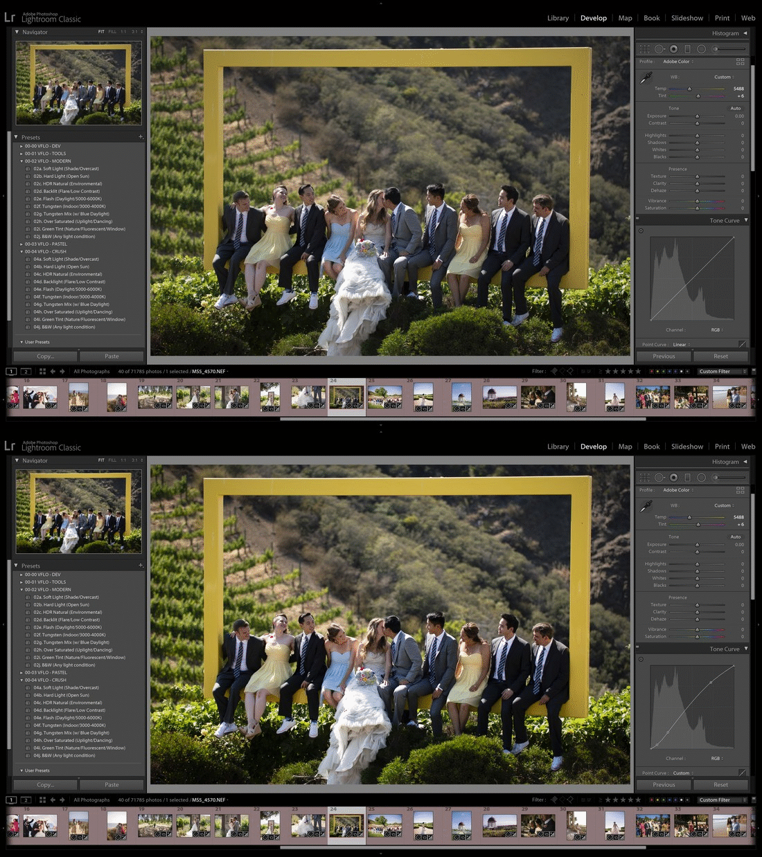
The concept of a tone curve is very simple once you realize what you’re looking at. In Lightroom, as with many photo editing apps these days, you have the added benefit of seeing your histogram overlaid on your tone curve. This allows you to visualize exactly which tones you’re adjusting!
If you’re really good at reading a histogram, then you can brighten or darken exact portions of your image’s tonal range just by looking at the histogram when you select a point on the curve’s default line.
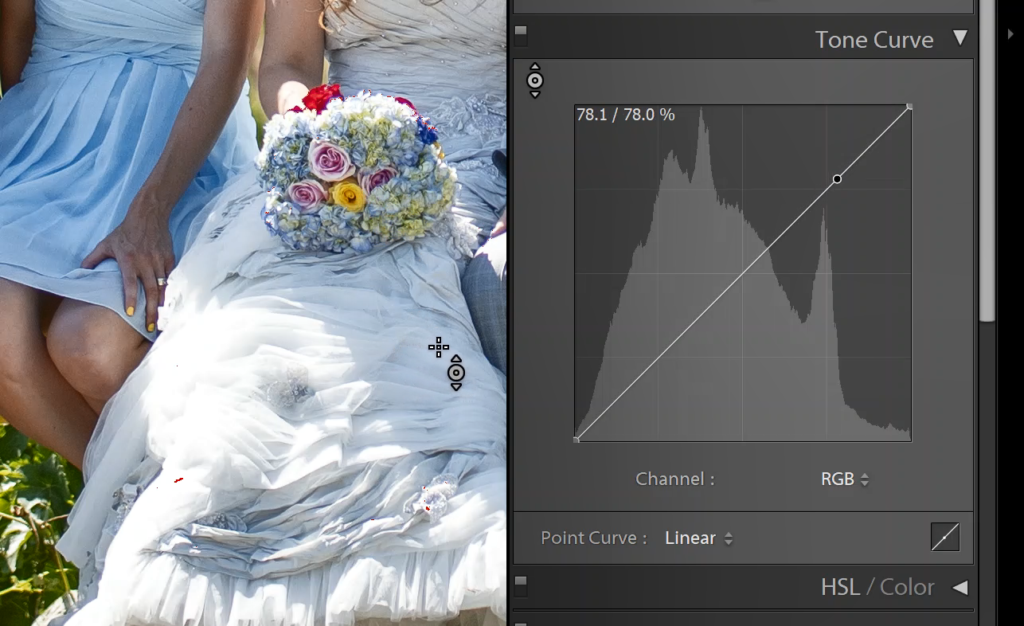
If you’d like some help in knowing exactly where to create a point, but you can clearly see the part of your image that, say, needs more contrast, then you can use the dropper tool to pick one or two points in the image, and create curve points to manipulate those tones.
Modify Global Contrast Using An S-Curve Tone Curve
The classic way to use tone curves in most image editing software, whether it’s Lightroom or Photoshop or any other, is to increase the contrast of the entire image with a classic “S-curve”.

To create an S-curve tone curve, simply create at least two points, one in the highlights, and one in the shadows. The highlights’ point should go up, and the shadows’ point should go down, creating an S-shape curve, of course.
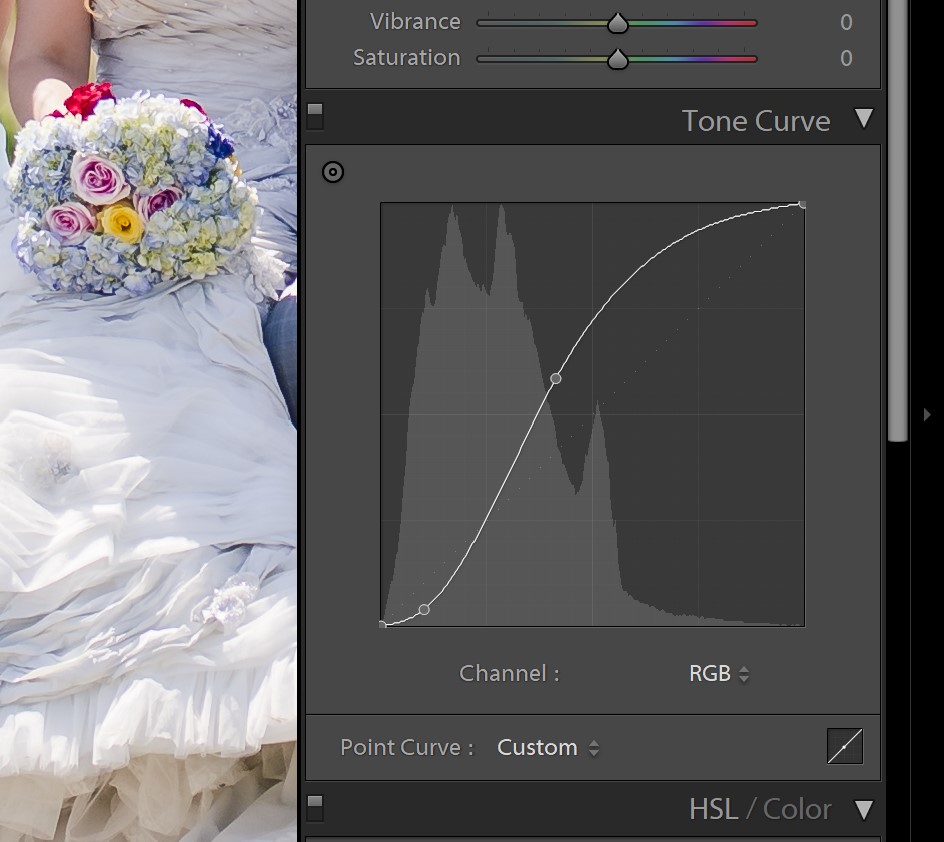
Of course, based on where your histogram falls in the image, you can easily manipulate where these two (or more) points go, in case you want to add contrast to either a high-key (bright overall) or low-key (dark overall) image.
Modify Shadow Or Highlight Brightness And Contrast Using Tone Curves
What if you actually do NOT want to affect most of the tones in your image, and you merely wish to lighten/darken, or increase the overall contrast of, a specific tonal range? This can be extremely difficult using any of the Basic sliders!
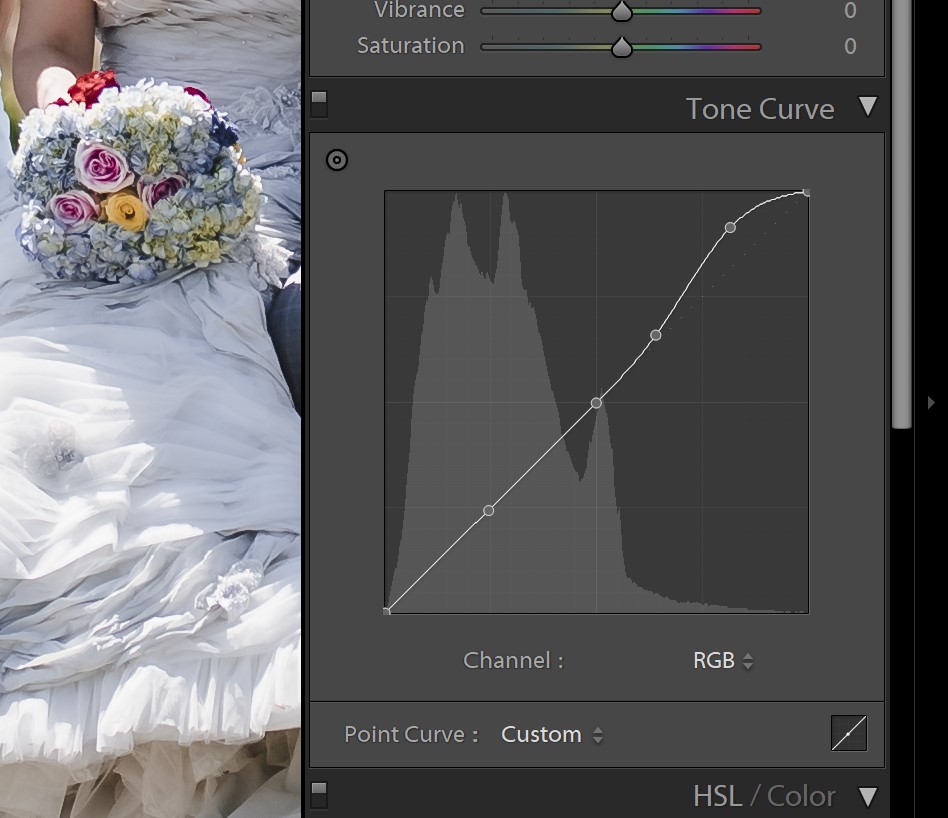
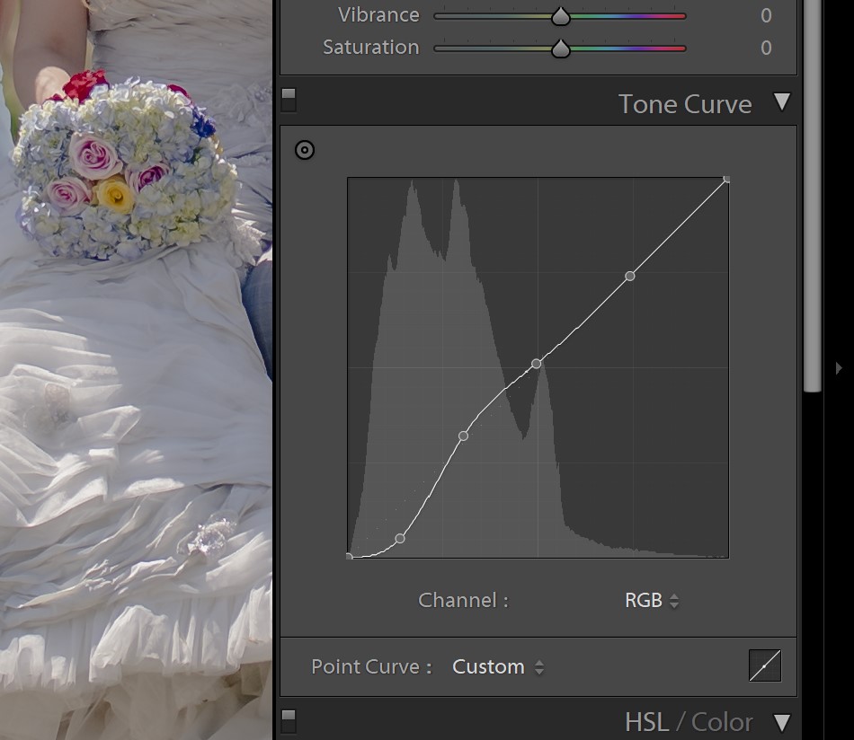
With curves in Lightroom, you can create enough points along the curve to keep some tones exactly where they started, while brightening or darkening others. Again, try using the “Dropper” tool to set the exact parts of your tonal range that you’d like to boost or reduce!
Modify White Or Black Points On A Tone Curve
For an even more advanced type of edit, let’s talk about what would happen if you dragged the actual ends of the default tone curve away from the corners of the graph!
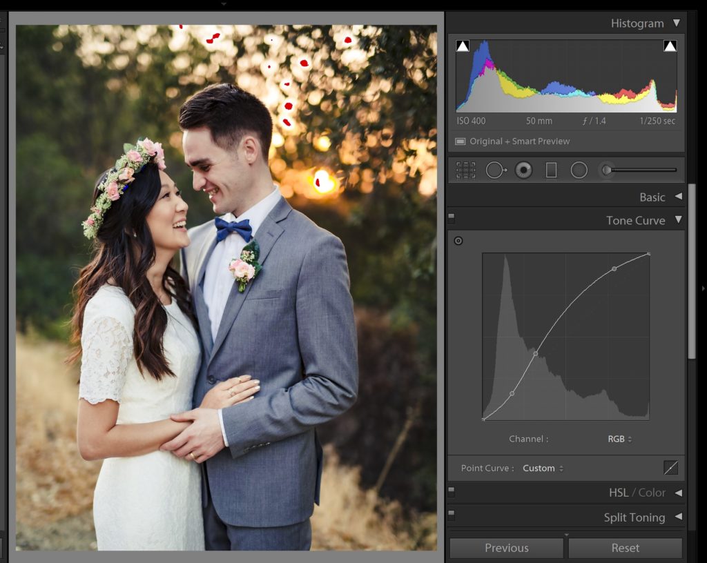
If you drag the black point towards the right, along the bottom of the graph, you will turn dark tones into pure black. This is usually only useful if your image has extremely low contrast, and there is no image detail on the left end of the histogram to begin with:
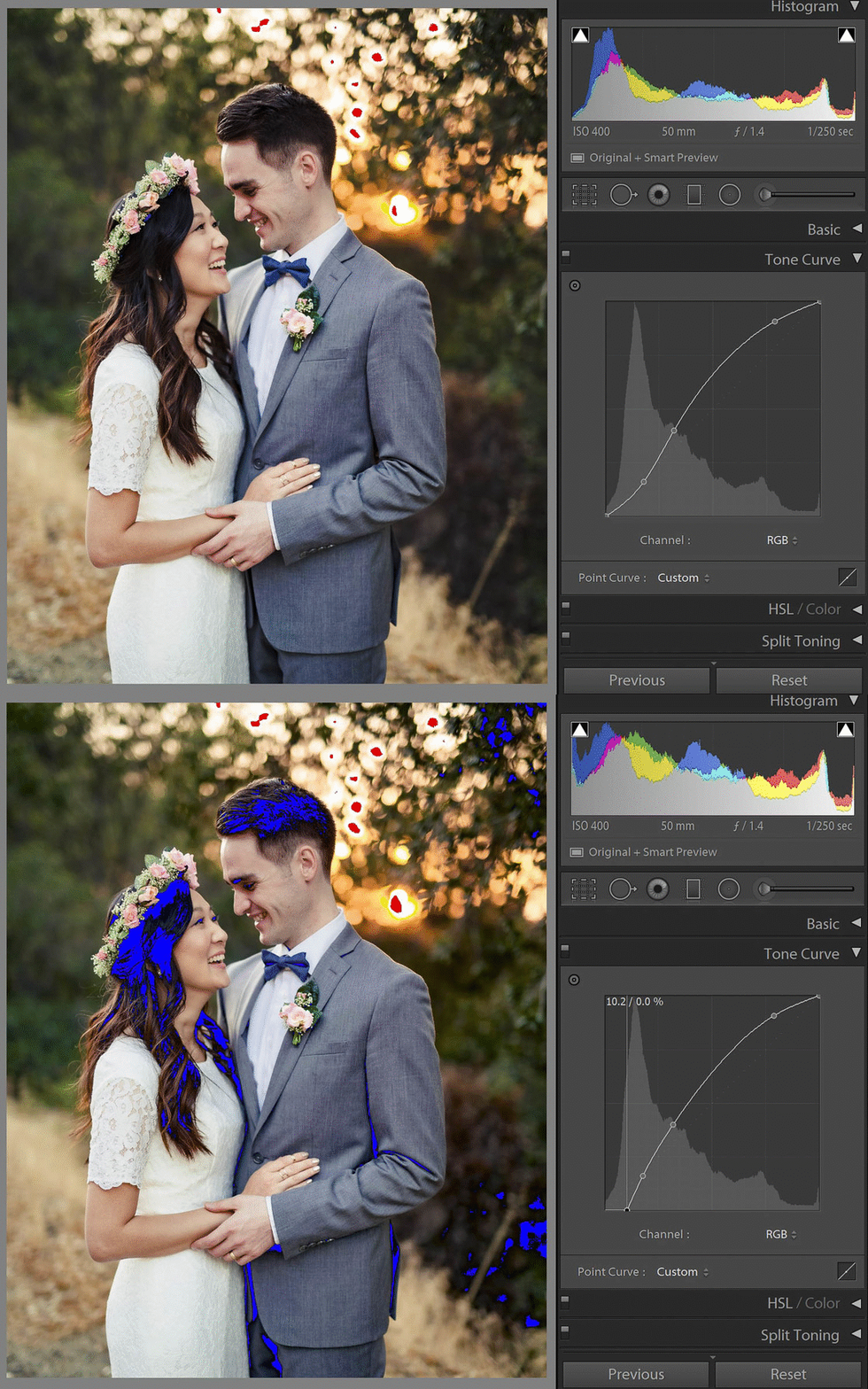
If you drag the black point up, along the left edge of the histogram, then you’ll turn whatever was pure black into something slightly lighter, or even grey if you go up towards the middle. This is useful if you want to create a faded, vintage look, HOWEVER, don’t overdo it! For stylized faded looks, just the slightest bump will do:
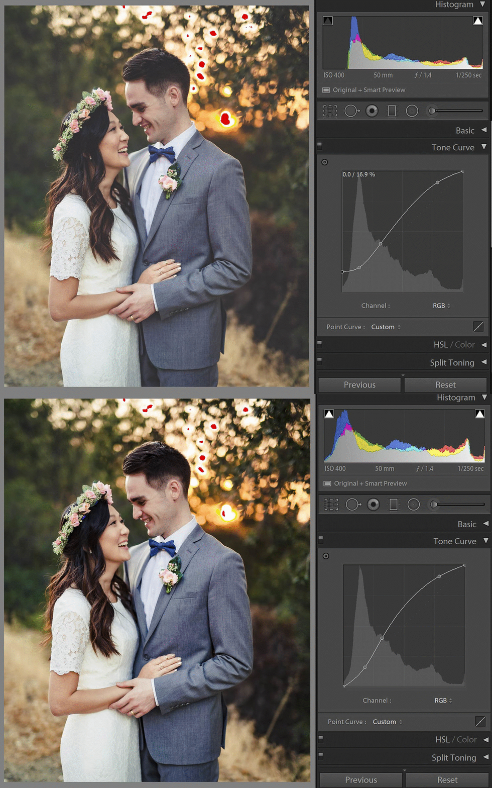
If you drag the black point away from both edges, up into the graph’s X and Y axis at the same time, then you will effectively be performing both functions at once- you will clip some blacks, while at the same time turning them into a flat, faded looking dark tone. Be very careful when doing this!
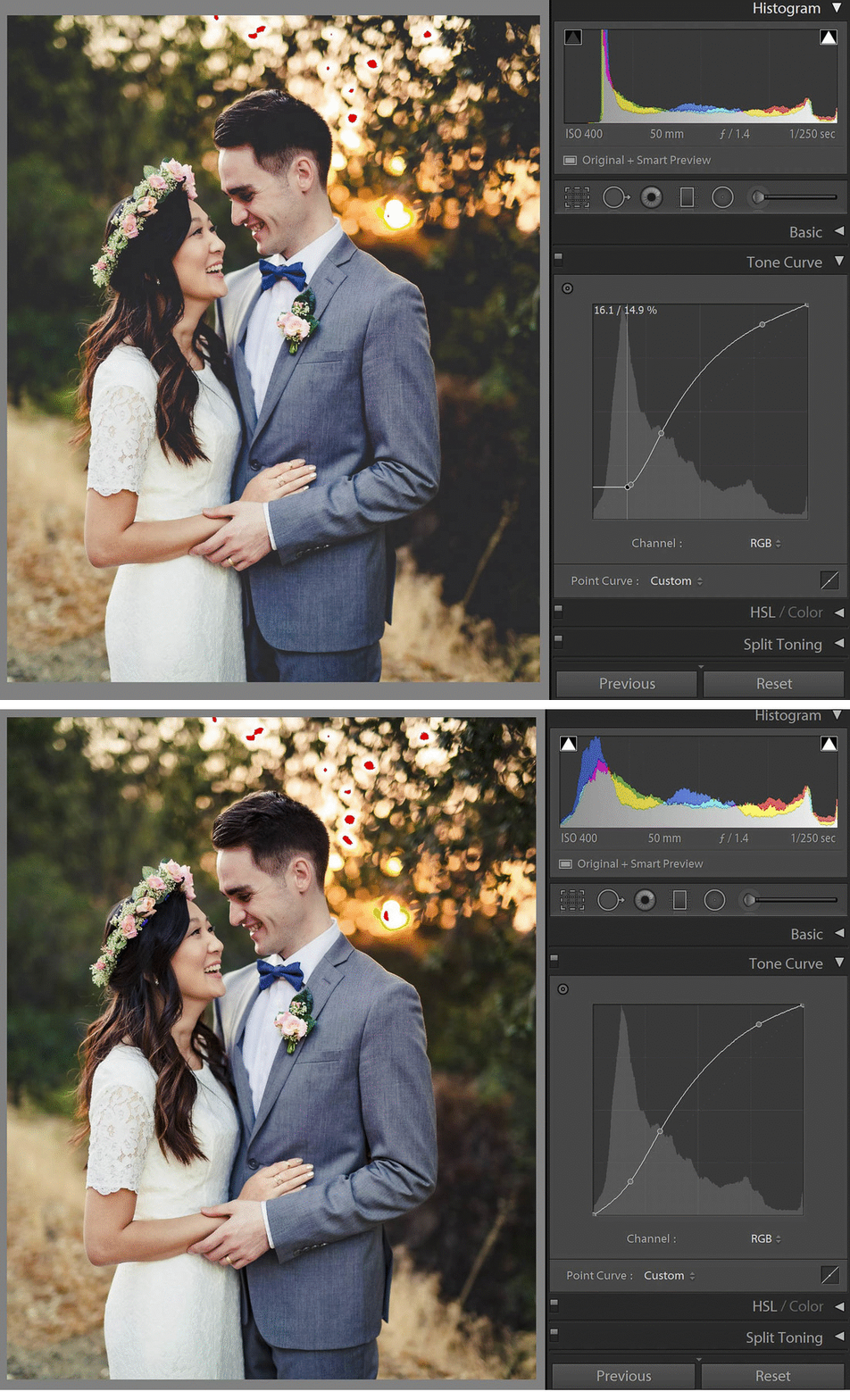
When doing these types of things to your white point, you’ll get a similar effect:

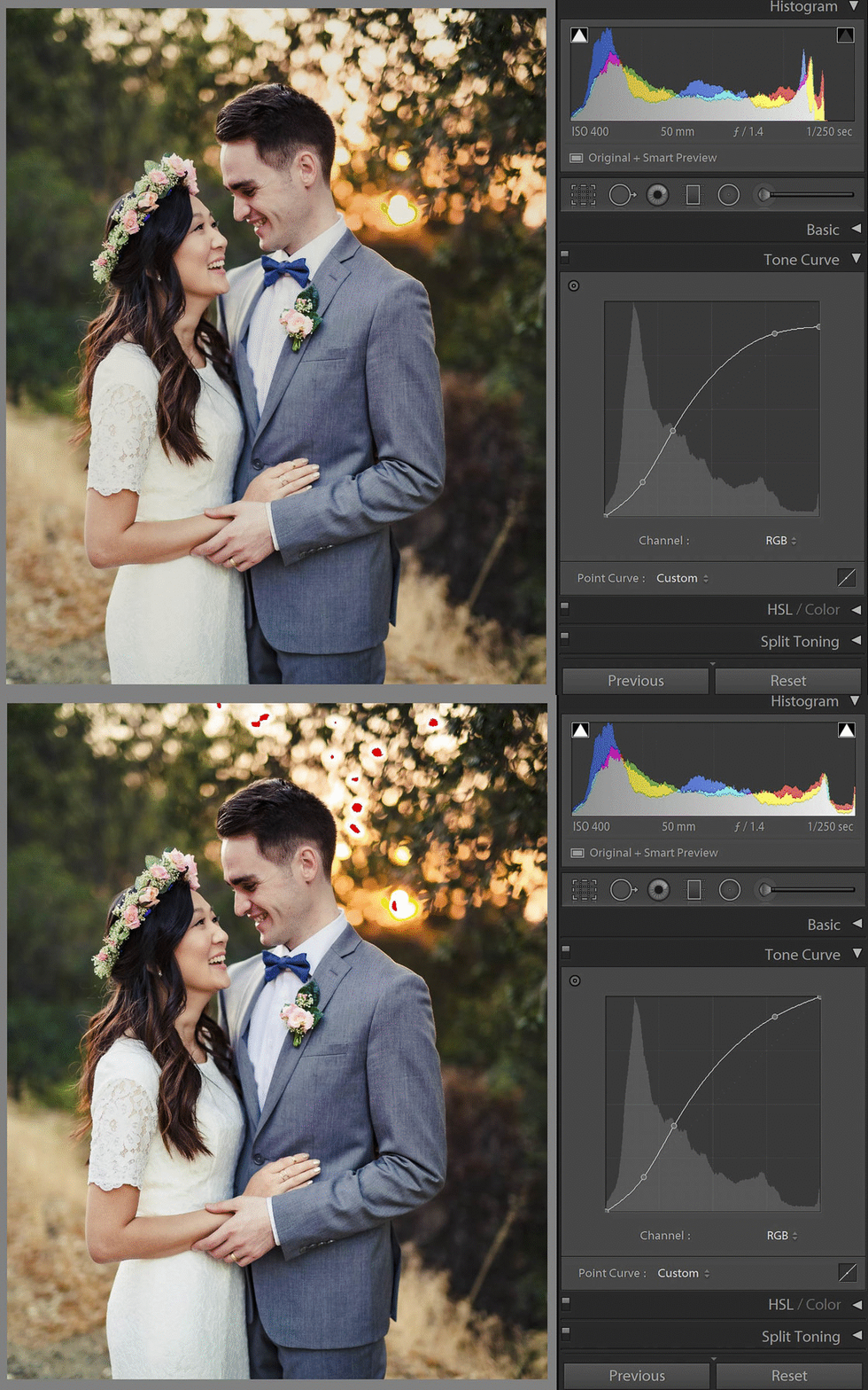

Dragging the white point leftward across the top of the histogram will clip your highlights to pure white. Dragging the white point down along the right edge will turn white into a light grey tone. And dragging the white point both downward and to the left will perform both dramatic adjustments at the same time. Again, be very careful with edits such as these!
Lightroom Point Curve VS Parametric Curve
If you’d like to adjust the tones in your image using the visualization of a tone curve, but you still enjoy the convenience of sliders, you can switch from the Point Curve to the Parametric Curve in Lightroom.
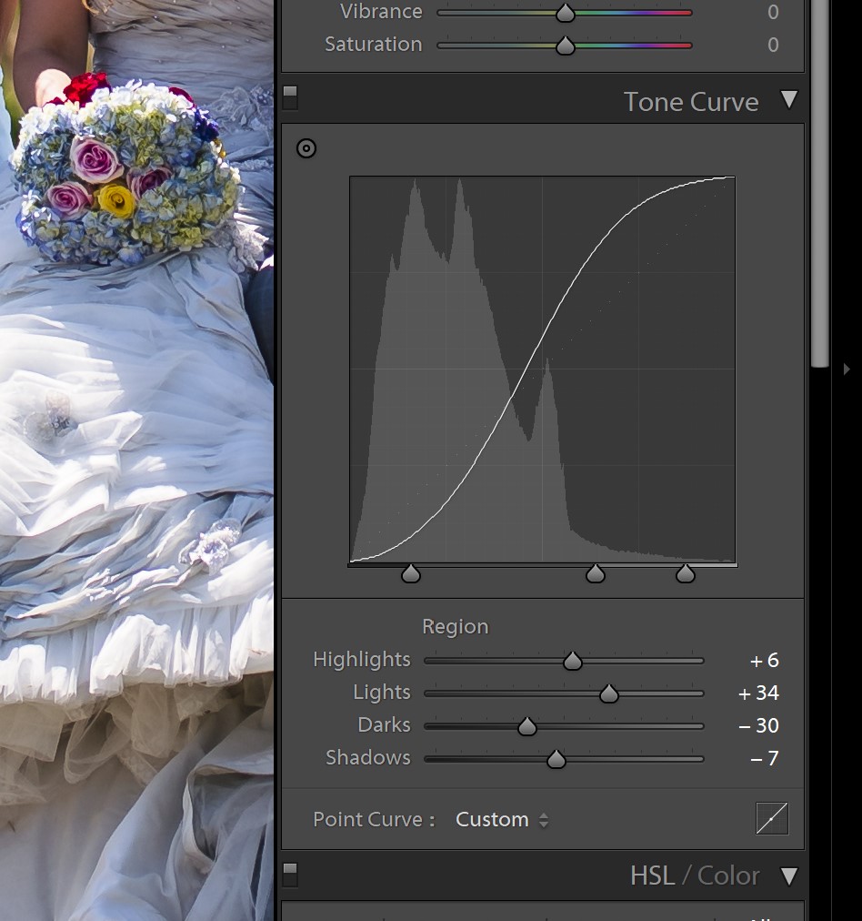
This brings up four sliders with the same names as the four main tonal sliders in the Basic section of the Develop Module, however, they operate independently from both the Basic sliders and the main tone curve itself. In other words, it is yet another new level of fine-tuning that you can use!
Again, these adjustments are meant to be used very sparingly, for fine-tuning contrast or lightness in zones that you just couldn’t get perfect with the rougher adjustments.
RGB Curves In Lightroom
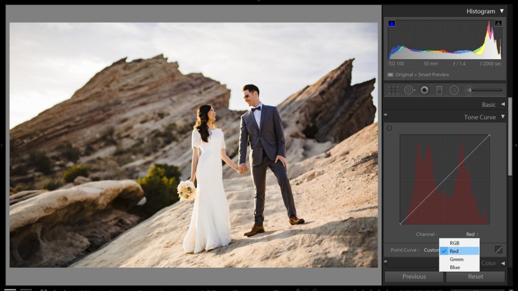
Last but not least, you can use curves to manipulate not just luminance tones altogether, but also individual colors. This is a very powerful process, and usually, just the tiniest bit of adjustment will have a huge effect on your image.
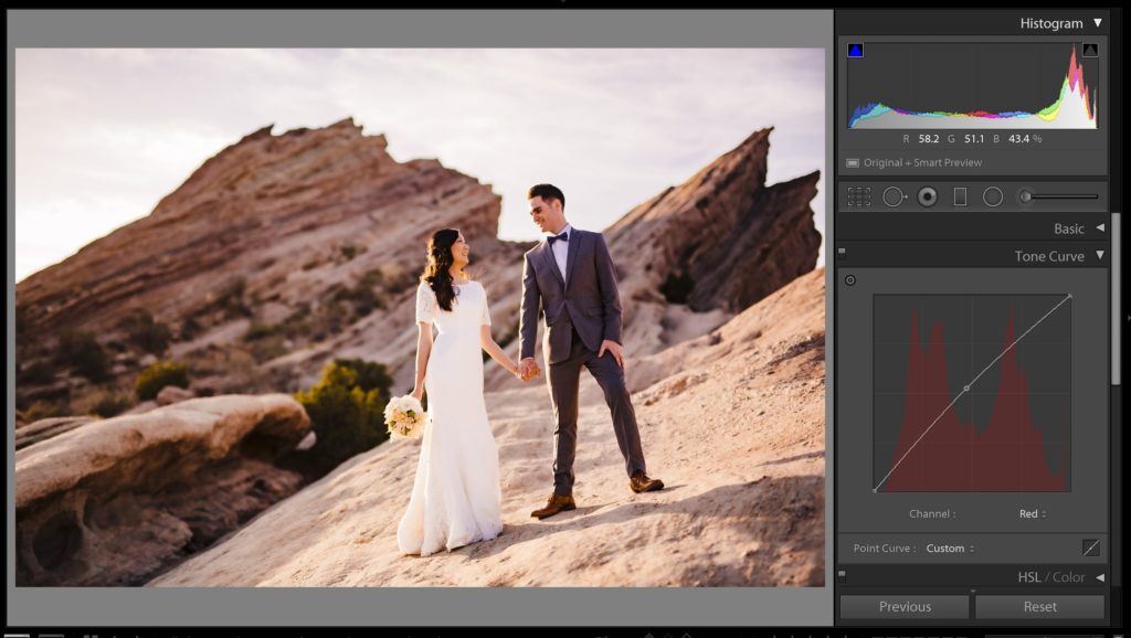
As a general rule, try to correct the overall warm/cool look of your images’ colors using the White Balance “Temperature” slider, and then use the next slider, “Tint”, to fine-tune any green/pink color casts.
Only then should you delve into RGB curves, for either achieving very specific, tricky corrections, or of course for totally creative looks. But again, be careful, usually the tiniest adjustment is more than plenty!
When Not To Use Tone Curves In Lightroom
Considering how omnipotent a tone cure in Lightroom might be, why not use it for 100% of your tonal management? You can add contrast to an entire image, or manipulate specific tones without affecting others, and you can even do really wild stuff with your black point and white point.
However, Lightroom’s Basic Develop Module sliders are still extremely powerful and should be used to perform the “heavy lifting” of processing particularly dynamic, contrasty images.
Why? Because while tone curves are extremely good at adding contrast, and brightening/darkening large ranges of tone in an image, they’re just not very good at doing the opposite- stretching the tones in an image, to fit the highlights and shadows of a high dynamic range (HDR) single exposure into the normal realm of contrast that we’re used to.
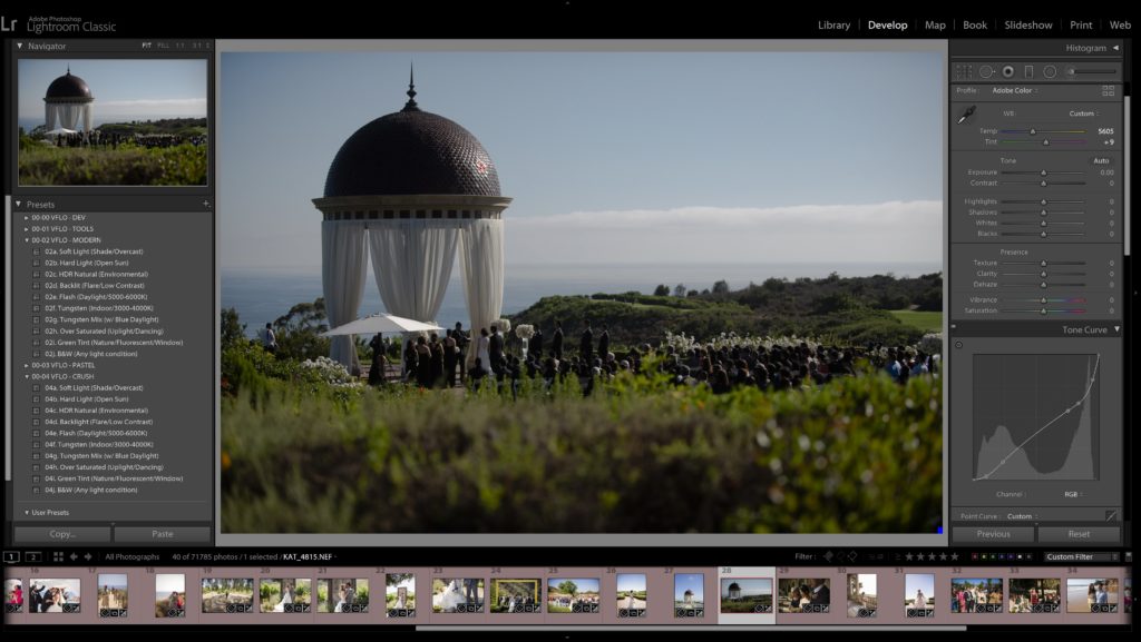
This is what the Shadows and Highlights sliders are really good at in Lightroom’s Develop Module. They can bring up very dark shadows, or bring down very bright highlights, and yet still render the whole image with pleasing contrast in the other tonal ranges.
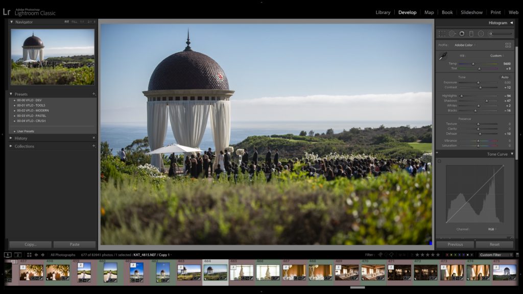
Usually, if you try to do too much “recovery” with curves, you’ll wind up with other portions of your image looking extremely flat, and downright weird in many cases. So, always remember to do most of your heavy lifting with the Basic sliders of Exposure, Highlights, and Shadows, (and the Whites and Blacks sliders, if necessary) …and then turn to your curves for even more subtle, precise fine-tuning of specific tonal ranges.
Learn More About Adobe Lightroom
To master more of Lightroom’s secrets and powerful tools, check out our complete Lightroom workshop series.

